COVID-19 DASHBOARD
Case study: California COVID-19 Response — using data visualization to turn raw data into actionable public insights.
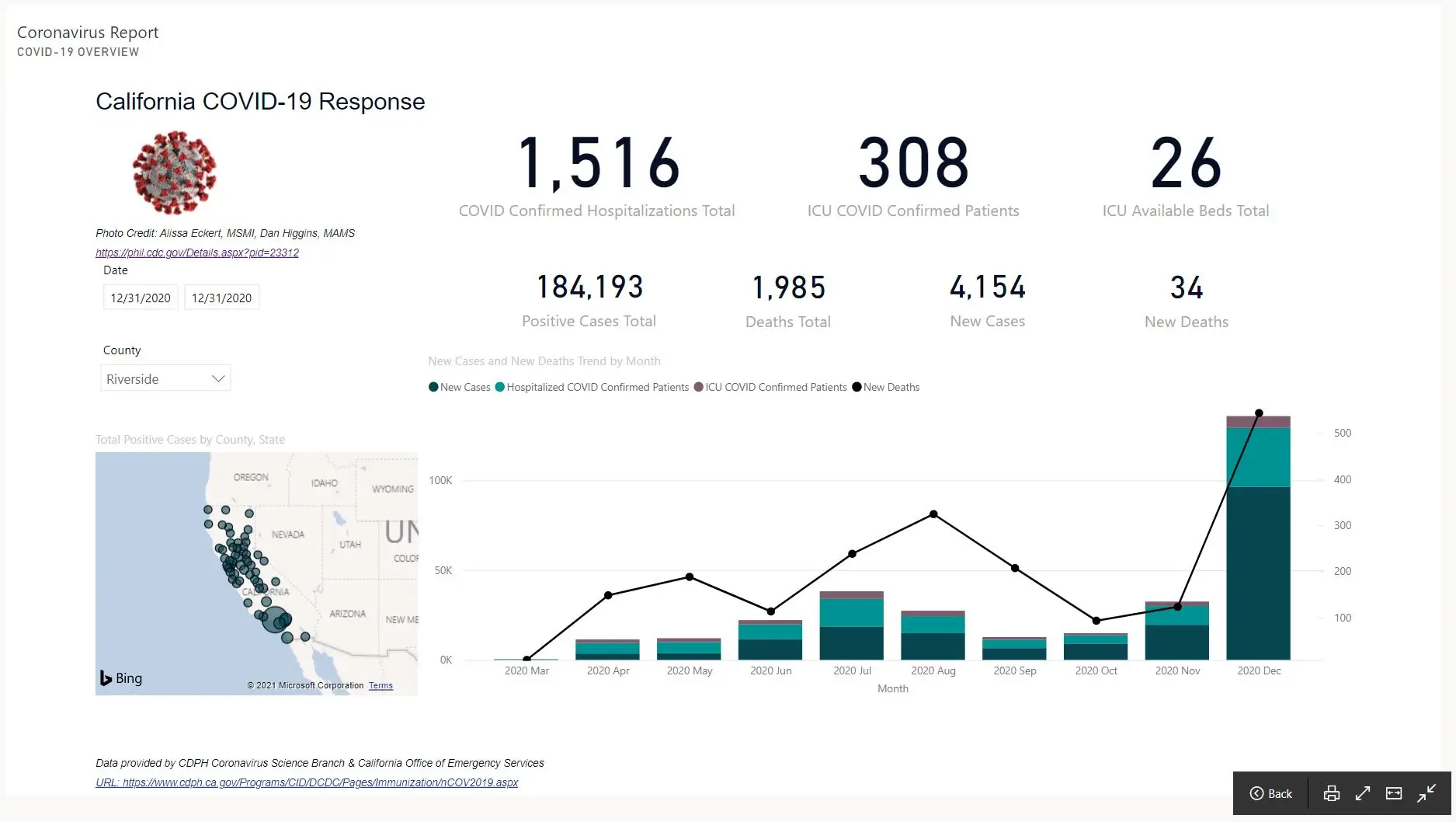
Project Overview
The California COVID-19 Response Dashboard visualized key pandemic indicators for state and county-level decision-makers. I designed the dashboard to communicate complex data — including hospitalizations, ICU capacity, and case trends — in a format that was both visually intuitive and analytically sound.
Challenge
In 2020, public data on COVID-19 was fragmented across multiple sources, making it difficult for health departments and citizens to access real-time insights. The goal was to consolidate verified data into a single, interactive dashboard that revealed trends and supported emergency response planning.
Solution
Using Power BI and Power Query I connected multiple datasets (including CDPH and CDC feeds) through SQL queries and data models. Key metrics — such as hospitalizations, ICU occupancy, and new case counts — were normalized and visualized dynamically by county. Visual hierarchy and consistent color palettes were applied for readability and accessibility.
Impact
The final dashboard provided an integrated snapshot of California’s COVID-19 response. It enabled health officials and the public to:
- Track daily case and hospitalization trends.
- Identify high-risk counties through visual mapping.
- Allocate ICU resources more efficiently.
Process
1. Discovery & Analysis
- Reviewed data feeds from the California Department of Public Health and CDC.
- Verified metric definitions and validation methods.
- Interviewed mock stakeholders to identify essential decision metrics.
2. Implementation
- Modeled relational data using SQL for county-level aggregation.
- Created Power BI visuals: line charts, stacked bars, and geospatial maps.
- Built dynamic filters (date range, county selection) for user interaction.
3. Results & Optimization
- Reduced report refresh time by optimizing query performance.
- Improved comprehension through color-coded trend segmentation.
- Added descriptive tooltips for context and transparency.
Key Deliverables
- Dashboard/Visualization: Interactive report tracking COVID-19 hospitalizations, ICU status, and new cases by month.
- Process Automation: Automated data ingestion from CSV/Excel feeds via Power BI gateway.
- Training & Documentation: Created a one-page data dictionary and walkthrough guide.
Lessons Learned
Designing for clarity under crisis emphasized the importance of consistent metric definitions and transparent data storytelling. Accessibility and simplicity proved just as critical as technical precision.
Technical Details
| |